Any scientific decision for improving the quality of a product or a process requires the collection, analysis, and presentation of a lot of data.
Kaoru Ishikawa of Japan had suggested seven simple tools that can be used for documentation, analysis, and organization of data needed for quality control. The tools are simple and can be used for more than 90 percent of industrial problems.
Table of Contents
Seven Old Quality Tools
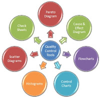
The seven old quality tools are
- Process flow chart
- Control chart
- Check sheet
- Pareto chart
- Cause and effect diagram or fishbone diagram
- Histogram
- Scatter diagram.
Flow Chart
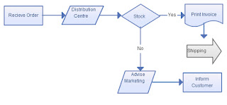
Process flow charts are the charts that show the sequence of operations in a process. They are also known as run charts.
The flow chart must indicate the process as it is actually proceeding and not as planned or originally visualized. Flow charts can be drawn in a number of possible ways like pictures, symbols, line diagrams, etc, and can be drawn to represent the entire process.
Control Chart
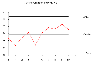
These charts are used in statistical quality control of the process to decide whether the process as currently being run is in statistical control or to decide whether the process has the capacity to meet the specified tolerances.
When the process is in control, any variation in the data is due to some random causes and no corrective action taken out. If any process found out of control is subjected to assignable causes which need to be investigated and rectified to avoid the production of unacceptable or defective parts.
Each chart in the above figure shows the central mean line and lines for Upper Control Limit (UCL) and Lower Control Limit (LCL) based on statistical consideration.
For the process to be within statistical control, the data obtained from the testing of random samples must be within UCL and LCL.
Check Sheet
A check sheet is a manual graphical method of data collection generally used for acceptance sampling.
Check sheet helps in collecting data in a systematic and organized way.
The above figure shows a check sheet of reworked jobs of respective departments. As the checking continues, whenever a job is reworked, a tick or a mark is made in the correct column. This ensures fast, easy and error free data collection.
Types of check sheets –
- Defective items check sheet.
- Defective location check sheet.
- Defective cause check sheet.
- Checkup confirmation check sheet.
Pareto Chart
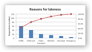
Pareto charts are based on the 20-80 rule which is named after Vilfredo Pareto in 1897. While investigating the distribution of wealth and income in Italy, Pareto discovered that “a small percentage of any given group (20 percent) accounts for a high amount (80 percent) of certain characteristics.” This is called 20-80 or Pareto principles.
Knowing that 80 percent of the trouble is caused by 20 percent of the problems, the data is collected and is used to identify these troubles causing the problems and to take them first.
For example to know the lateness in a company is shown in the above figure. A line drawn from 60 percent locates that traffic and child care needs to be taken up first for rectification.
Cause and Effect Diagram
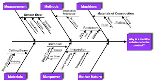
It is also known as a fishbone diagram due to its shape like a fishbone. Cause and effect charts are the charts devised to study how an unacceptable part is produced.
When an unacceptable part is produced, it becomes necessary to analyze the production process to identify the cause for the production of such part so that necessary corrective action can be initiated to stop the production of more such parts. This is done best with the help of cause and effect diagrams.
Defects in the production may occur mainly due to machine, method, materials, measurement, men, or environment as shown in fig.
In the cause and effect study, all these elements are listed and the factors causing the defect related to each of these elements are studied one after the other.
Histogram
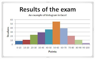
A histogram is a pictorial representation of data to show the spread or variation of a set of data. It displays the frequency distribution of data.
Histograms are useful to quickly identify the points where maximum variation is occurring.
Scatter Diagram
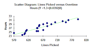
A scatter diagram is a mathematical approach for studying correlations between factors that are suspected to be related to each other. These diagrams provide a quick, simple, and easy way to interpret such relationships.
The following steps are involved in drawing and interpreting scatter diagrams.
- Select the two factors in which the relation is required to be studied. These factors may be detected from the cause and effect diagram for the production process.
- Collect the data. Data should always be collected in pairs and must be large enough to allow the establishment of any correlation.
- Draw axes of the scatter diagram.
- Plot each set of data.




It’s very simple to find out any topic on web as compared to books, as I found
this piece of writing at this site.
What’s up, I check your blogs on a regular basis. Your story-telling style is awesome, keep doing what you’re doing!